The Rise of MX (Machine Experience): Why your future users might not be human
By:
Bijay Ranjan Pati
29 Dec 2025
We have spent years perfecting the art of the thumb. We focus on reachability, contrast ratios, and keeping a distracted person from closing a tab. We consider the human eye as the final judge of truth. But while we were busy making buttons bigger and gradients smoother, the user changed.
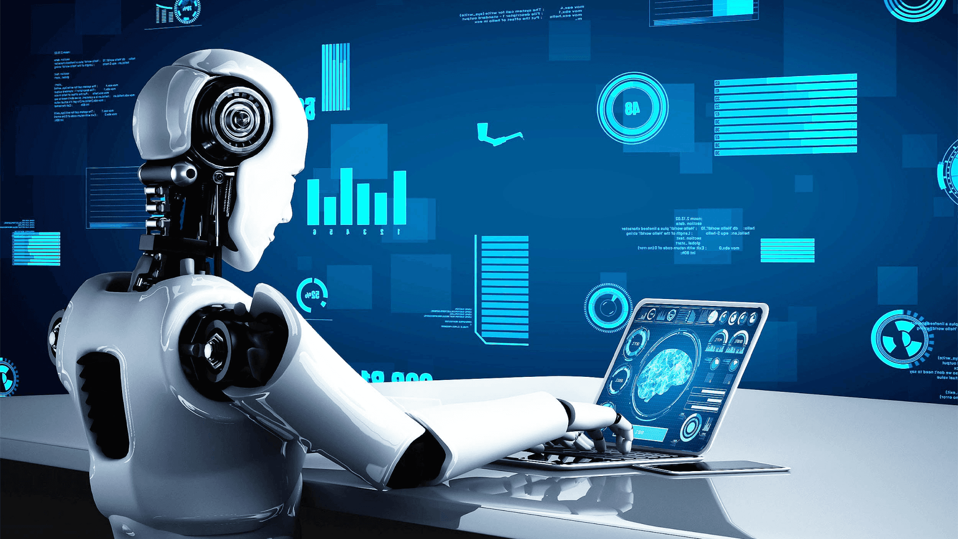
Your next power user doesn't have eyes. It doesn't have a thumb. It doesn’t get excited by a bouncy micro-interaction, and it definitely doesn't care about your brand's exact shade of cerulean.
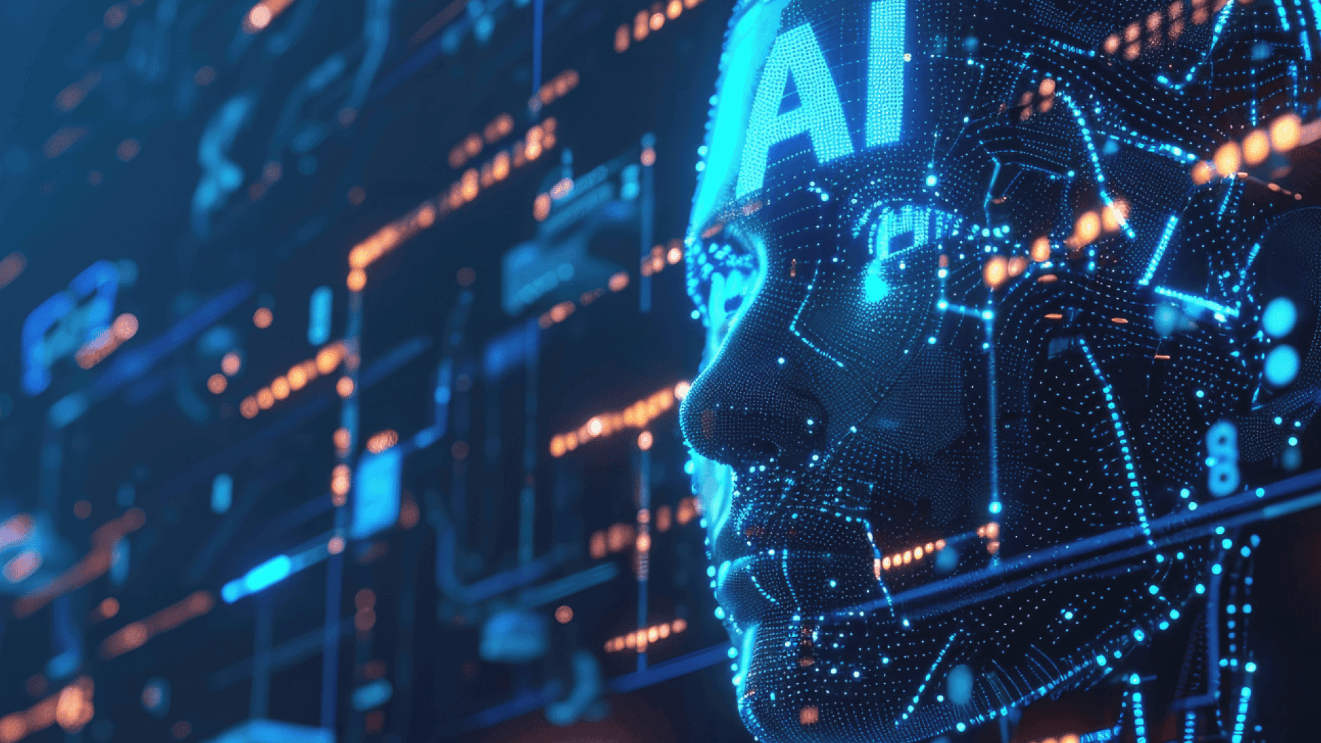
We are entering the age of Machine Experience (MX). If you’re still designing only for people, you’re targeting a shrinking audience.
The pivot from eyes to logic
For a long time, UX focused on managing how much information people can handle. We hide complexity behind clean layers because they can easily become overwhelmed. We use progressive disclosure to prevent them from panicking.
MX is different. A machine wants to see the "how." It seeks the skeleton, the structure, and the raw intent. When an agent comes into your product to complete a task for a human, it isn't searching for a "vibe." It’s looking for a clear path.
Many of the products we create today are becoming headless. The interface is just one way to interact with the system, and it’s often the least efficient. If a machine has to "scrape" your polished UI to figure out what a button does, you’ve failed as a designer. You’ve created obstacles for the most important user in the process.
Clarity over Beauty
In traditional UX, we often sacrifice clarity for a cleaner look. We use icons without labels because they seem more polished. We choose vague, clever copy because it creates brand personality.
In MX, minimalism means having well-structured data and a clear hierarchy. A machine needs to understand exactly what an object is, its current state, and what actions are possible. It requires clear logic.
If your product’s Delete action is hidden in a three-dot menu that only appears when you hover over it, you have created a problem for an automated agent. You have prioritized a human's desire for a clean appearance over the essential function of the action.
Good MX ensures that the design is so clear that a machine can navigate it without any confusion. This doesn’t mean the UI has to be unattractive. It means the UI should reflect a strong logical foundation, not disguise a flawed one.
The designer’s new seat at the table
There’s a common mistake in product teams right now. They believe that designing for machines is just a "backend problem." They think it’s only about the API documentation.
That’s a trap.
If you are a designer, you are responsible for the flow of information. When an agent is trying to book a flight, summarize a document, or move data between two tools, that is a user journey. The fact that the traveler is a script and not a person does not change that the journey can be broken, confusing, or efficient.
We have to stop thinking of "the screen" as our only canvas. Our canvas includes the system of permissions, the hierarchy of data, and the predictability of the output. We need to start discussing with engineers how data is exposed, not just how it’s rendered.
Why we keep getting it wrong
Most teams still focus on "human-first" appearances. They spend weeks creating a landing page but only five minutes on how agents actually interact with data.
We often think that because a machine is "smart," it can handle our poor design. It can’t. Or, more accurately, it shouldn't have to. When we make a machine deal with a messy, inconsistent user interface, we create delays, errors, and extra costs.
The biggest design mistake you can make right now is believing that your visual interface is the "source of truth." It isn’t. The real truth lies in the model behind your product. If that model is unclear, no amount of attractive UI will improve the experience for the machine or the person who will eventually deal with any mistakes made by the machine.

Build for the invisible
The goal isn’t to stop designing for humans. It’s to understand that people are increasingly relying on machines for their user experience. We are creating tools that other tools will use.
If your design system doesn’t consider how a non-human interprets information, you’re creating a legacy product in real-time.
Take a break from worrying about the perfect button radius. Start asking if your product's intent is clear when the lights are off and the screen is not visible. Clarity is the only thing that can grow.
Would you like me to create a set of "MX-first" design principles for your team to use during your next sprint?
Frequently asked questions
1. What is Machine Experience (MX) in simple terms?
Machine Experience (MX) is how well software systems are structured so AI agents, bots, or automation tools can understand, navigate, and act on them without relying on visual interfaces.
2. Does designing for MX mean traditional UX design is no longer important?
No. UX still matters, but MX adds another layer. Good products now need to work equally well for humans and machines, with clear logic powering both.
3. How can teams start designing MX-friendly products today?
Start by exposing clear data structures, predictable actions, and well-defined states through APIs and schemas, then ensure the UI reflects that same clarity.
Explore our services