The UI design trends for 2027 are less about a look than about who, and what, the interface is for. Apple is still tuning Liquid Glass, Figma put motion on the canvas, and Google now generates whole interfaces in Gemini.
The specifics: Apple's iOS 27, previewed at WWDC in June 2026, added a transparency slider that runs "from ultra clear to fully tinted", MacRumors reports. Figma's Config 2026 shipped Motion and shader fills on June 24. Google Research's generative UI work put AI-built interfaces in front of real users.
The takeaway? In 2027, bold visuals win attention, but only interfaces that stay readable, accessible and trustworthy keep it.
Key Takeaways
- Design for two users now: people and the AI agents acting for them. Clear structure beats clever layout.
- Bold is back with evidence: Google's research found people spotted key elements up to 4x faster in its expressive designs, but a strong minority still preferred calmer ones.
- For EU services covered by the Accessibility Act, WCAG 2.1 AA is now the legal bar, so every trend needs a readable fallback.
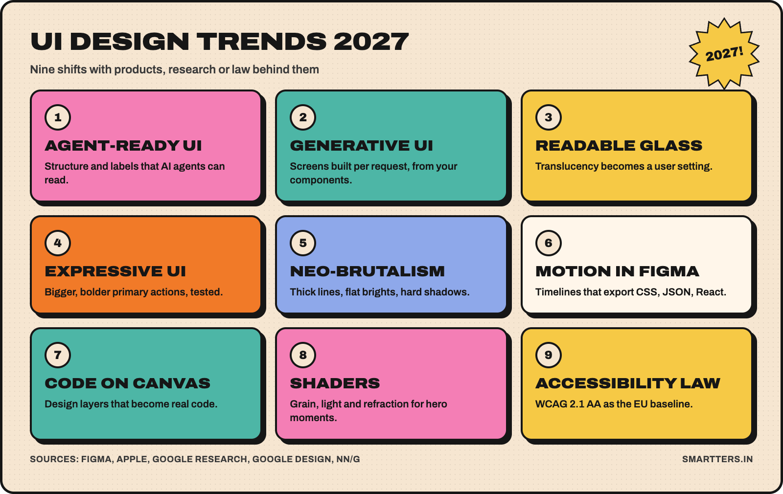
The 9 UI design trends for 2027 at a glance
We picked nine trends that have shipped products, published research or law behind them. Each comes with what to do about it.
- Interfaces designed for AI agents, not just people
- Generative UI: screens built per request
- Readable Liquid Glass
- Expressive UI, backed by research
- Neo-brutalism grows up
- Motion becomes a design deliverable
- Design and code share one canvas
- Shaders and tactile materials
- Accessibility as the legal floor
1. Interfaces designed for AI agents
Your next heavy user may not have eyes. Agents read structure, labels and states, not gradients. Nielsen Norman Group's State of UX 2026 (January 16, 2026) says UI is "no longer a differentiator", partly because more interactions are mediated by AI.
What to do: use semantic HTML and proper accessibility labels, keep one clear action per screen, and expose state in text, not just colour. We covered the idea in depth in The Rise of MX (Machine Experience).
2. Generative UI: screens built per request
Google Research described generative UI on November 18, 2025 as a model that "generates not only content but an entire user experience". Its Gemini experiment, dynamic view, designs and codes a custom interactive answer for each prompt. In Google's evaluation, expert-made websites were still preferred most, with generative UI "closely" behind and far ahead of plain text answers.
Google also lists the limits: results can take a minute or more, with occasional inaccuracies.
What to do: don't redesign your product around it yet. Do build a strict component library and design tokens, because generated screens are only as good as the parts they're assembled from.
3. Readable Liquid Glass in iOS 27
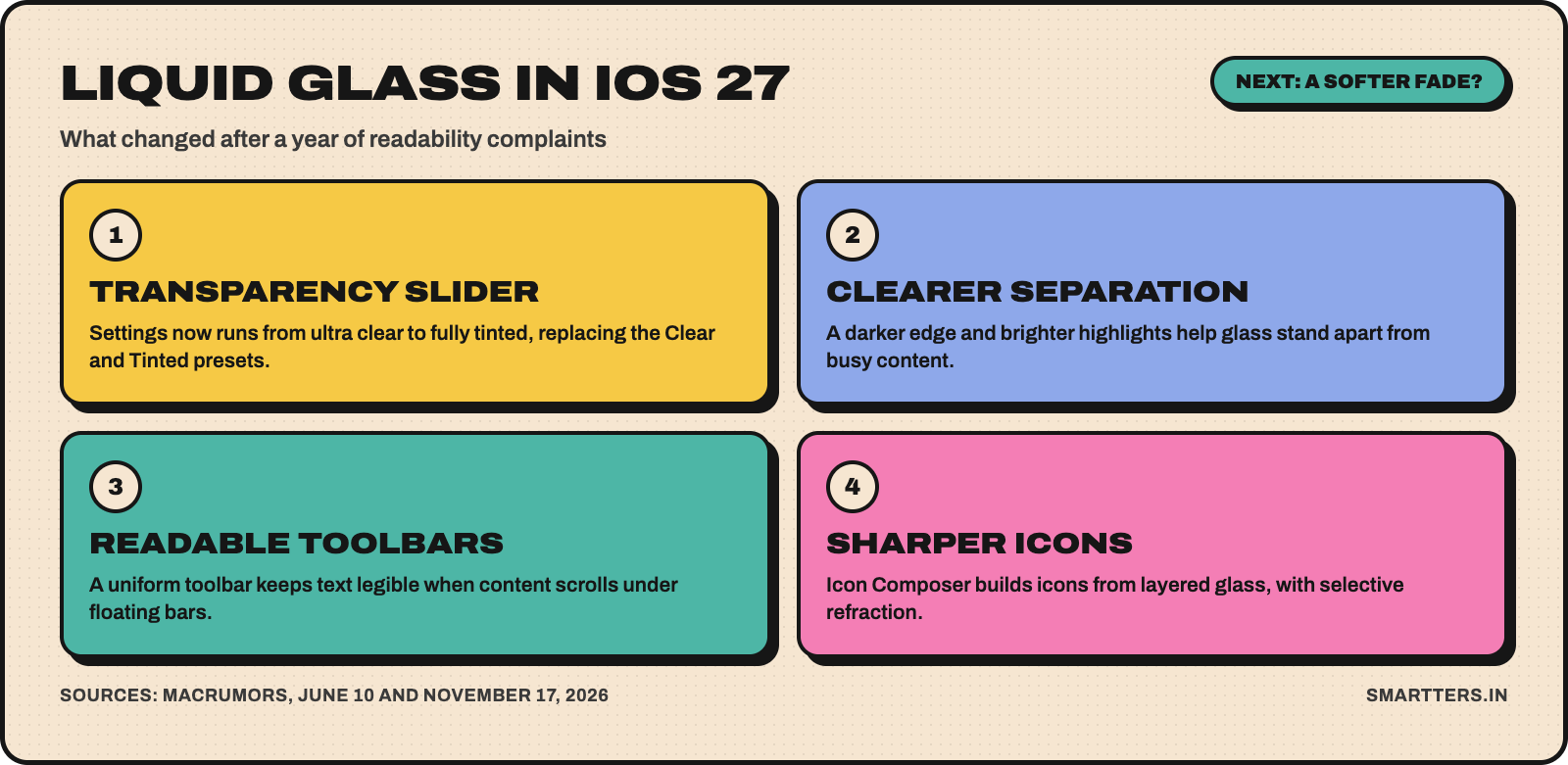
Liquid Glass didn't go away. It got controls. In iOS 27, Apple added a transparency slider and a darker edge with brighter highlights for separation. A uniform toolbar now keeps text legible when content scrolls under floating bars.
On November 17, 2026, MacRumors reported a hidden "gradual fade" for navigation bars, disabled by default in iOS 27.3 beta 2. Apple hasn't confirmed it.
What to do: treat translucency as a setting, not a constant. Always test with Reduce Transparency and Increase Contrast turned on. Our first take is in Apple Liquid Glass: A New Trend or Fail?
4. Expressive UI, backed by research
Google calls Material 3 Expressive "the most researched update" to its design system: 46 studies and more than 18,000 participants, according to Google Design. In eye-tracking tests, participants spotted key UI elements up to four times faster, and people over 45 performed on par with younger users.
The same research found where it breaks. Removing text labels from email actions hurt usability, a playlist redesign that dropped the familiar list pattern scored worse, and "a strong minority" preferred calmer versions.
What to do: make the primary action bigger and more colourful, but keep labels and familiar patterns. More in Why Material 3 Expressive Signals the End of Minimalist UI.
5. Neo-brutalism grows up
The style on this post's images is neo-brutalism: cream backgrounds, thick outlines, flat bright panels and hard shadows. NN/g's neobrutalism definition names high contrast, blocky layouts, bold colours, thick borders and "unpolished" elements, and cites Figma's brand refresh and Gumroad. It also warns the style can overwhelm users and hurt accessibility without balance.
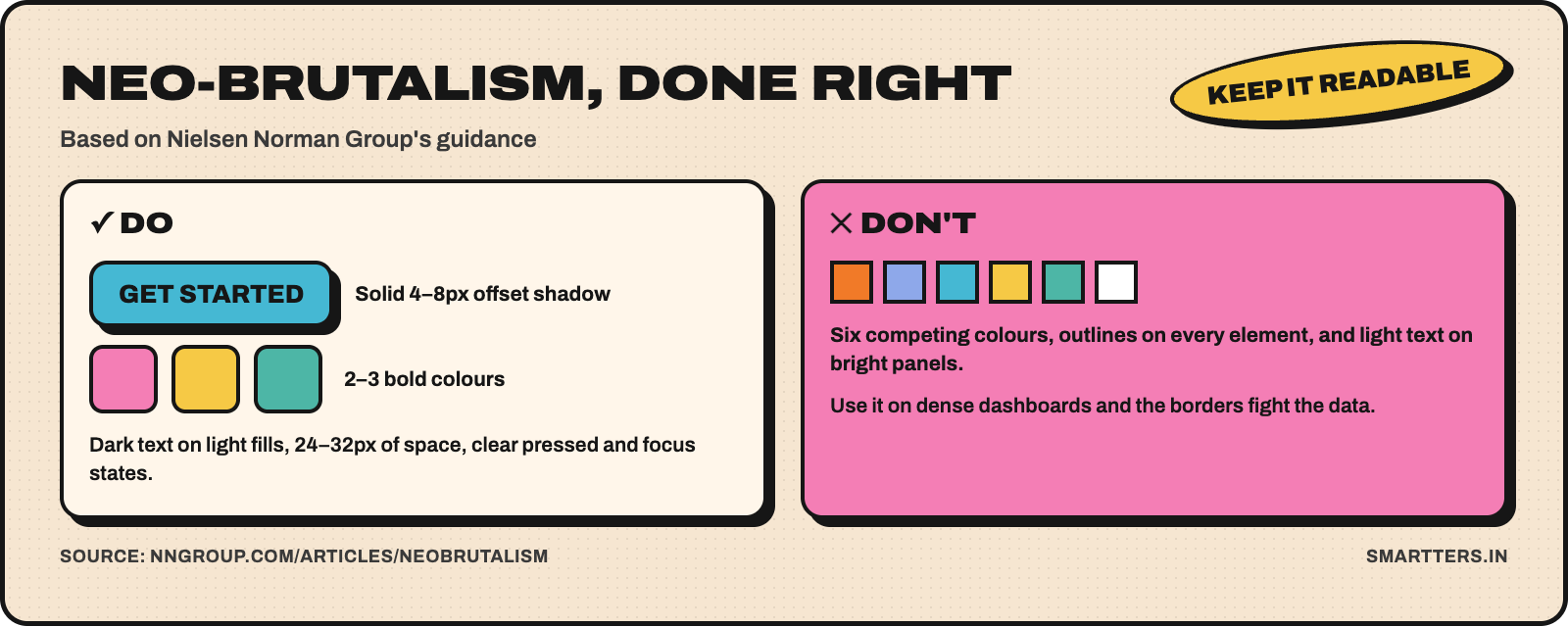
What to do: use it for brands that want personality: portfolios, consumer apps, launches. Keep it to 2–3 bold colours, check text contrast, and leave 24–32px of breathing room, as NN/g suggests. Avoid it for dense dashboards, where heavy borders compete with the data. If you're deciding how loud to go, our Minimalism vs Maximalism breakdown helps.
6. Motion becomes a design deliverable
At Config 2026, Figma added Motion, a timeline with keyframes and presets inside Figma Design. Dev Mode exports it as CSS, JSON or React code, and you can export video such as MP4 or animated SVG. Motion stops being a separate After Effects file that developers rebuild by eye.
What to do: define motion tokens (durations, easing, distances) next to your colour and type tokens. Animate state changes and feedback first, decoration last. Respect reduced-motion settings everywhere.
7. Design and code share one canvas
Figma's code layers turn a design layer into interactive code "with just a single click (or a prompt)", rolling out via waitlist from July 2026. The Figma agent launched to everyone at Config. Figma's 2026 AI report, its third annual survey, says designers are coding and developers are designing at record rates.
What to do: designers should learn enough code to read a component's props, and developers should own the token pipeline. The handoff is becoming a shared file, not a meeting.
8. Shaders and tactile materials
Flat colour isn't the only material anymore. Figma shipped shader fills and effects that you describe in plain language. Apple's Icon Composer now builds icons from multiple Liquid Glass layers with refraction. Expect more grain, depth and light in brand moments.
What to do: keep these effects for heroes, icons and empty states. Never put body text on a moving or refracting surface, and check performance on mid-range Android phones before shipping.
9. EU accessibility law: EAA and WCAG 2.1 AA
The European Accessibility Act has applied since June 28, 2025. It covers services such as e-commerce, banking, e-books and transport. For websites and apps, the bar is WCAG 2.1 AA through the EN 301 549 standard. One year in, enforcement has been "complaint-driven and corrective-first", with fix-it deadlines rather than headline fines, according to AllAccessible, a company that sells accessibility software.
What to do: if your product falls under the EAA, audit contrast, focus states, labels and keyboard paths now. Every trend above needs an accessible version, and that's cheaper to design in than to retrofit.
Which 2027 trends should you adopt now?
Trend Verdict Best for Trade-off
Agent-ready structure
Adopt now
Every product
Less room for clever, unlabelled layouts
Accessibility baseline
Adopt now
EAA-covered services, and everyone else
Audit time up front
Expressive primary actions
Adopt now
Consumer apps
Some users prefer calmer UI
Motion tokens
Try on one project
Teams already on Figma
Needs dev buy-in to keep in sync
Neo-brutalism
Try on one project
Brands, portfolios, launches
Ages fast, tiring in all-day tools
Readable glass
Try on one project
iOS-first apps
Extra testing across transparency settings
Code layers
Watch
Design systems teams
Still rolling out
Shaders
Watch
Marketing pages, icons
GPU and battery cost
Generative UI
Watch
AI products
Slow and sometimes inaccurate today
What are the downsides of these trends?
Expressive and neo-brutalist styles age fast and can feel loud in tools people use for eight hours a day. Glass and shaders cost GPU time and battery. NN/g's report calls 2026 "the year of AI fatigue": if an AI-generated screen can't be checked or undone, users stop trusting it.
What we don't know yet: whether Apple ships the softer Liquid Glass fade, and how fast code layers leave beta.
How we checked this
We built this list from Figma, Google Research, Google Design and NN/g, plus MacRumors and AllAccessible reporting, all linked and dated above. We didn't run our own benchmarks for this post. The verdicts are our opinion as a team that designs and ships mobile and web apps every week through our UI/UX design work.
Frequently Asked Questions
What are the UI design trends for 2027?
Nine stand out: agent-ready interfaces, generative UI, readable glass, expressive UI and neo-brutalism. The rest are motion designed in Figma, design and code on one canvas, shaders, and accessibility law. The common thread is bolder visuals with stricter rules for readability.
Is neubrutalism still popular in 2027?
Yes. NN/g cites Figma's brand refresh and Gumroad as examples, and it suits portfolios, consumer brands and launches. It works best with 2–3 bold colours, solid offset shadows and strong text contrast. It's a poor fit for dense, data-heavy dashboards.
Is Apple getting rid of Liquid Glass?
No. Apple refined Liquid Glass in iOS 27 instead of removing it, adding a transparency slider and legibility fixes. MacRumors reported in November 2026 that Apple is testing a softer fade for navigation bars, but Apple hasn't confirmed it.
Will AI replace UI designers?
Not on current evidence. In Google's own tests, expert-made sites were still rated highest, ahead of generative UI. NN/g says adaptability, strategy and discernment are the skills that will matter most, so designers who own systems, research and decisions are in the strongest position.
How do I follow design trends without hurting usability?
Change the styling, not the patterns people rely on. Keep labels, familiar navigation and contrast ratios, then test with accessibility settings on. Google's expressive research found that removing labels or a familiar list pattern lowered usability scores.
Planning a 2027 redesign? Start with your highest-traffic screen, apply the three "adopt now" trends, and measure task completion before and after.